

Which measures should we include in our City’s CAP? Should we prioritize some over others? Which measures are, in terms of cost, the best for us to implement, while still achieving our GHG reduction goals? However jurisdiction staff phrase the question, what they are really hinting at is: how cost-effective are climate action plan (CAP) measures at reducing greenhouse gas (GHG) emissions? The previous post in this series provided the general framework for climate action plan (CAP) benefit-cost analyses (BCAs). Here, we take a deeper look at the first component of a CAP BCA – evaluating the cost-effectiveness of CAP measures. This post will discuss what cost-effectiveness results mean in the context of a CAP and its target years, best-practices for viewing results, and challenges when comparing results between multiple CAPs.
The concept of cost-effectiveness in the broader climate change field is not new. It garnered wide attention with release of the first McKinsey cost curve in 2007 (Figure 1), which examined the cost to abate one ton of CO2e and the GHG reduction potential for various reduction strategies. However, the application of cost-effectiveness analyses in local climate action planning has been, until recently, seldom discussed.
Understanding results
The cost-effectiveness of CAP measures is expressed in dollars per metric ton of carbon dioxide equivalent ($/MT CO2e) and, as with any metric, it’s important to understand what it represents. Simply put, it is the net benefit or net cost to reduce one ton of GHG emissions. But understanding what gets packaged into a measure’s $/MT CO2e value is a bit more complex. Aside from standard economic calculations (e.g., normalization and discounting), some adaptations can be made to align calculations with CAP goals.
CAPs generally have reduction targets for specific target years (e.g., reduce X tons in 2020 and Y tons in 2030). This poses a challenge for cost effectiveness analyses: how to account for all activities that will contribute to GHG reductions in a given target year. Since most measures and actions will have multiple installation years (the year in which an activity first occurs), the benefits, costs, and GHGs reduced from an activity in one year could be different than the same type of activity that starts in following years (e.g., changes in installation price, rebates that have since expired, etc.). Since the GHGs reduced in the target year are not always equal for all actions in years previous, one solution is to calculate the weighted average $/MT CO2e from all the activities that contributed to reductions in that year regardless of their start year. To do this, all benefits and costs associated with actions taken to achieve target year GHG reductions are incorporated into the analysis and then scaled according to their contribution of greenhouse gas reductions in the target year. Figure 2 is an illustrative example showing how the $/MT CO2e and GHG reductions in a single year can vary according to the year an activity has started. In this example, all installations in 2018 reduced 8 MT CO2E of GHG emissions with a net benefit of $10/MT CO2e. These results vary across years. A weighted average approach helps to provide a representative result that takes into account all installation years being considered in the analysis, in this case 3 years.
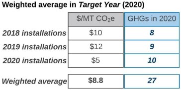
Figure 2. Illustrative Example of Weighted Average Inputs
Aside from the general calculations that go into a measure’s $/MT CO2e, which perspective(s) are being shown. Our first post in the CAP cost analysis series identifies five perspectives, which represent impacts to various stakeholder groups. When comparing the cost-effectiveness of a suite of measures, it can be helpful to take a more holistic view. The Measure perspective provides the broadest view for this purpose and includes: the jurisdiction’s costs to implement and administer a CAP measure, the benefits and costs of those directly involved in a CAP measure activity, and the costs associated with funding subsidies that offset some of the costs incurred by participants.
Looking at Results
Clearly communicating results is an important step to ensure that decision-makers and the public understand the meaning and key take-aways. Selecting proper visualization tools is paramount to clearly and effectively presenting results for a wide audience. Primary visualization tools that we have identified include: (1) tables, (2) scatterplots, (3) marginal abatement cost curves, (4) and paired bar graphs.
Tables
Tables can pack a lot of information into a small space. The illustrative example in Table 1 shows how results for multiple perspectives and multiple measures can be displayed together and summarized for the whole CAP. Red values indicate measures with a net cost per metric ton; black values are those with a net benefit. A potential downside to tables is that they can be overwhelming and make it difficult to identify the main take-aways from the analysis (e.g., which measures are most cost-effective and have a high GHG reduction potential).
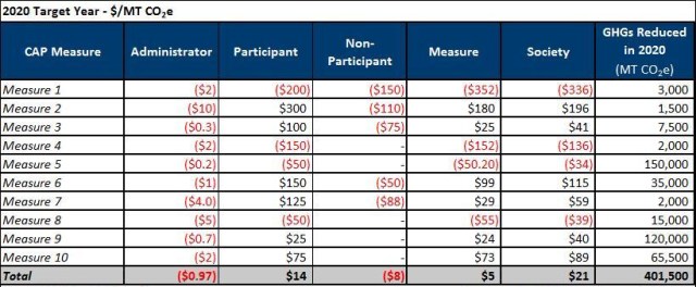
Table 1. Example CAP Measure Cost-Effectiveness Table
Scatterplots
Presenting the cost effectiveness results alone may not tell the whole story. A measure might be very cost-effective, but have a relatively small potential to reduce emissions. Pairing $/MT CO2e results with the potential of a measure to reduce GHG emissions can be helpful. Scatterplots are one way to do this. They can be used to present results for a single perspective and illustrate the relationship between a measure’s $/MT CO2e and corresponding GHG reductions (MT CO2e) in a specific target year. Highlighting this relationship can provide added context when evaluating the cost-effectiveness of measures (e.g., which measures are cost-effective and have a high reduction potential?).
This type of figure helps the reader identify those measures that are the most/least cost-effective as well as those that have a high/low potential to reduce GHG emission. Each point on a scatterplot represents an individual measure and is found by plotting the GHGs reduced by that measure along the x-axis versus the $/MT CO2e for that measure along the y-axis (Figure 3 and Figure 4). The higher a measure is on the plot, the more cost-effective it is (e.g., Measure 2, Figure 4); the lower a point is, the less cost effective it is (e.g., Measure 1, Figure 4). Similarly, measures further to the right on the plot reduce more GHGs than measures to the left (e.g., Measure 5 versus Measure 4, Figure 4).
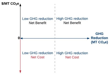
Figure 3. Interpreting Results of a Scatterplot
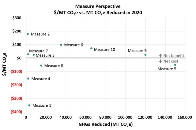
Figure 4. Illustrative Scatterplot Example
Marginal Abatement Cost Curves
The McKinsey cost curve (Figure 1) is a prime example of a marginal abatement cost curve (MACC). A MACC is structured like a scatterplot—the y-axis shows the $/MT CO2e and the x-axis the GHGs reduced. However, there are some noticeable differences. In a MACC, measures or policy options are indicated by a bar rather than a point, and traditional MACCs generally express $/MT CO2e in terms of cost; this means that a positive value represents a cost and a negative value represents a benefit. Additionally, the x-axis is expressed as cumulative GHGs reduced, where the width of a bar represents the potential GHGs reduced by that measure and measures (bars) are ordered from the most cost-effective to the least cost-effective (highest benefit to highest cost). A drawback to using a MACC is that measures with comparatively low GHG reductions can be hard to identify; the width of the bar would be flattened on a scale necessary to accommodate measures with large GHG reductions.
Paired Bar Graphs
Paired bar graphs also help to make it easier to distinguish how measures relate to one another in terms of cost-effectiveness and GHG reductions. Here, a measure’s estimated GHG reductions (MT CO2e) are plotted in one bar graph and its cost-effectiveness ($/MT CO2e) is plotted below in a second bar graph (Figure 5). Unlike a scatterplot, a bar graph can show more than one perspective at a time, making it possible to analyze multiple components at once, though adding multiple perspectives can make it harder to interpret the results.
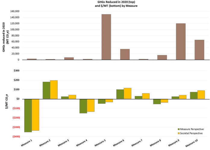
Figure 5. Illustrative Paired Bar Graph Example
Comparing CAPs
Jurisdiction staff often want to compare these results with that of other CAPs. The framework discussed in this series of posts to estimate the cost-effectiveness of CAP measures is intended to make results comparable across measures within a CAP, not necessarily from one CAP to another. However, cost-effectiveness results across CAPs are not necessarily compatible. Significant dissimilarities can arise when two or more CAPs have different baseline years or use different methodologies for GHG reduction calculations.
For example, cost-effectiveness calculations often incorporate historic data where applicable to account for past activity that leads to GHG reductions included in the CAP to achieve emission reduction targets. For example, if a CAP has a baseline year of 2010, all related GHG reduction activity between 2010 and the CAP’s target year(s) would be considered to calculate the $/MT CO2e. Since trends in pricing can change over time, the application of more historic data in one CAP relative to another can inherently favor or disfavor one CAP measure over the same measure in the other CAP.
Additionally, while methods for GHG reduction calculation consistent for an individual CAP, they may not be consistent across CAPs. This discrepancy can give varying results when comparing CAPs with similar measures by changing the denominator in the $/MT CO2e equation.
CAP BCAs in Practice
EPIC has completed several analyses for jurisdictions in the San Diego region that calculate the cost-effectiveness of CAP measures, including County of San Diego and City of La Mesa.
Up Next
This was the fourth in a series of posts about CAP cost analyses. Our next post will focus on the remaining question answered by a CAP BCA: what are the financial implications for those who participate in CAP measure activities? Our last post will further identify common limitations and challenges currently faced when conducting CAP cost analyses and discuss ways to build upon the framework described here.

Pingback: The Cost of a CAP Part 5: The Cost (or Benefit) to Participate | The EPIC Energy Blog
Pingback: The Cost of a CAP Part 6: Limitations | The EPIC Energy Blog